

Ever walk into a room and feel like it’s almost right—but something’s missing? That “something” is often color. Accent colors have a quiet power. They wake up neutral spaces, add personality, and make your home feel intentional without a full makeover. The good news? You don’t need a design degree to get it right.
Let’s break down how to pick accent colors that instantly refresh your home—step by step, stress-free, and totally doable.
Start With What You Already Have
Before you chase trending shades, take a look around. Your home is already giving you clues.
Ask yourself:
- What colors are in your sofa, rug, or curtains?
- Do you see warm tones (beige, tan, wood) or cool ones (gray, white, stone)?
- Are there materials that stand out, like leather, brass, or natural wood?
Your accent colors should support what’s already there, not fight it. A good rule:
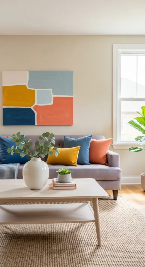
- Warm base = warm accents (rust, mustard, soft green)
- Cool base = cool accents (navy, teal, charcoal)
This approach keeps everything feeling calm and connected.
Choose One Main Accent Color First
Trying to juggle too many colors at once is where things start to feel messy. Instead, pick one main accent color and build around it.
This color will show up most often in:
- Pillows
- Throws
- Small decor pieces
- Artwork details
Once you lock this in, everything else gets easier.
Helpful tip:
- If you love bold colors, use them in small doses
- If you prefer calm spaces, go for muted or dusty tones
Both can feel fresh—it’s all about balance.
Use the 60–30–10 Rule (Without Overthinking It)
Design rules sound intimidating, but this one is simple and flexible.
- 60%: Your main color (walls, large furniture)
- 30%: Secondary color (rugs, curtains, chairs)
- 10%: Accent color (decor, art, pillows)
Your accent color is that final 10%. It’s not supposed to take over—it’s there to catch the eye.
Easy ways to apply it:
- One bold lamp
- A colorful tray on a coffee table
- A few matching cushions across the room
Small touches make a big impact.
Pull Inspiration From Nature
If you’re stuck, nature is the safest place to look. These colors already work together, which makes them easy to live with.
Think about:
- Soft greens from plants
- Sandy beige and stone gray
- Ocean blues and sky tones
- Clay, terracotta, and warm earth shades
These shades feel fresh without feeling trendy—and they age beautifully over time.
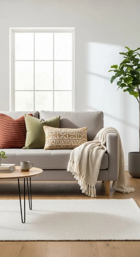
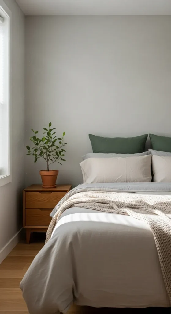
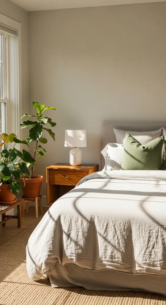
Repeat Your Accent Color in Small Ways
One accent item can feel random. Repetition is what makes it look intentional.
You don’t need matching sets. Just echo the color:
- A pillow that matches a vase
- Artwork that includes the same tone
- A book spine or candle in a similar shade
This creates visual flow and makes the room feel styled, not accidental.
Quick check:
- Can you spot your accent color in at least three places?
If yes, you’re doing it right.
Test Before You Commit
Colors behave differently depending on light. What looks perfect in-store can feel off at home.
Before committing:
- Bring home fabric swatches or sample items
- View them in morning and evening light
- Place them next to your existing furniture
Low-risk ways to test:
- Pillow covers
- Throws
- Removable decor
If you love it after a week, it’s a keeper.
Adjust Seasonally for an Easy Refresh
One of the best things about accent colors? They’re easy to swap.
You can refresh your home throughout the year by rotating:
- Pillow covers
- Throws
- Table decor
- Entryway accessories
Examples:
- Lighter tones in spring and summer
- Deeper, cozy shades in cooler months
No repainting. No big spend. Just a simple update that keeps your space feeling new.
Final Takeaway
Picking accent colors doesn’t have to feel overwhelming. Start with what you have, choose one main accent color, repeat it thoughtfully, and test before committing. Small changes can completely shift how your home feels.
Save this guide for later, grab a pillow or two, and start refreshing your space—one color at a time.

Leave a Reply